User Research
User Interviews
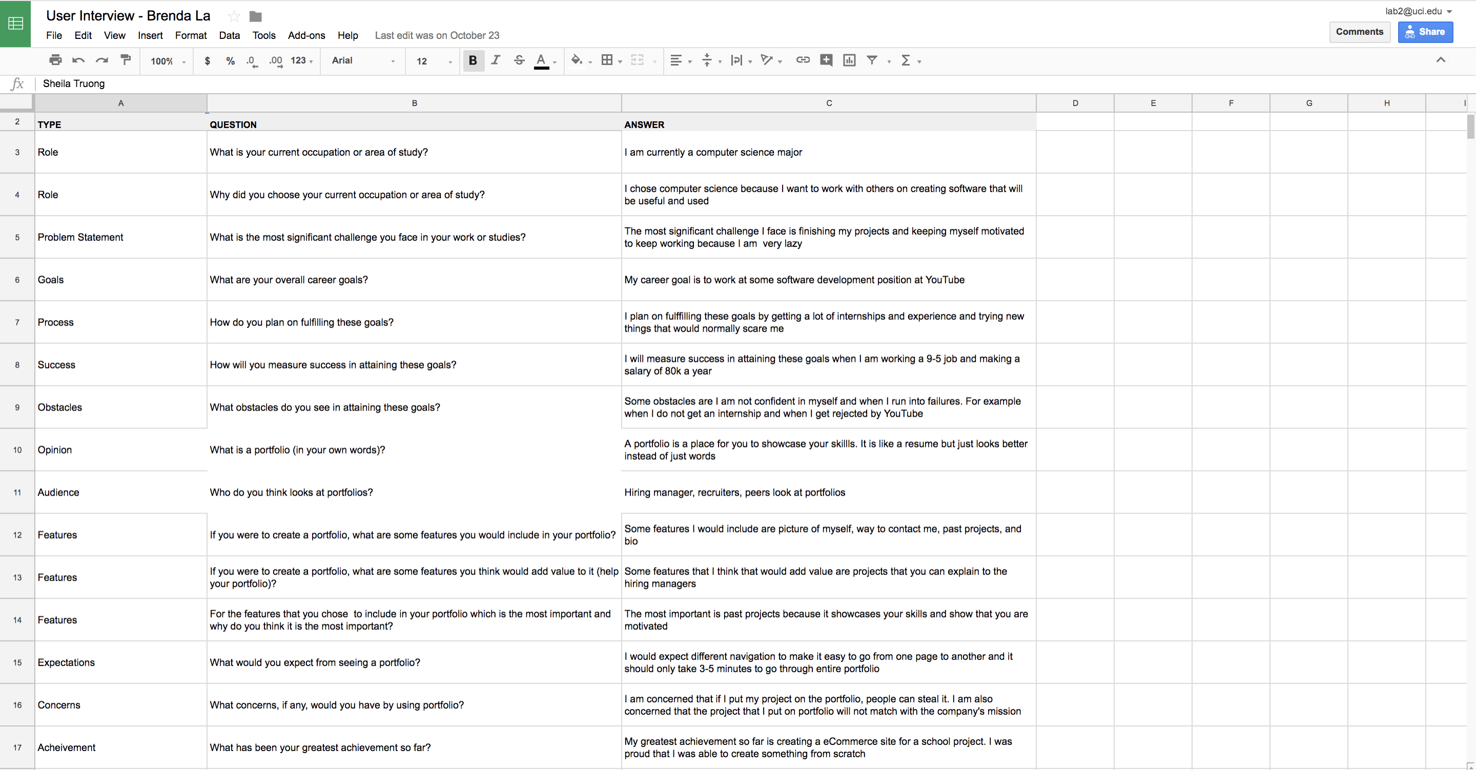
Before even starting the portfolio, I had to interview different users because it is important to understand who my users are and what they would want to see on a portfolio. I interviewed my colleagues and software developers who could be looking at portfolios during interviews. The user interviews included questions like what are their goals, how do they plan on achieving the goals, what is a portfolio to them, what features they would include in a portfolio, and etc.
Competitor Analysis
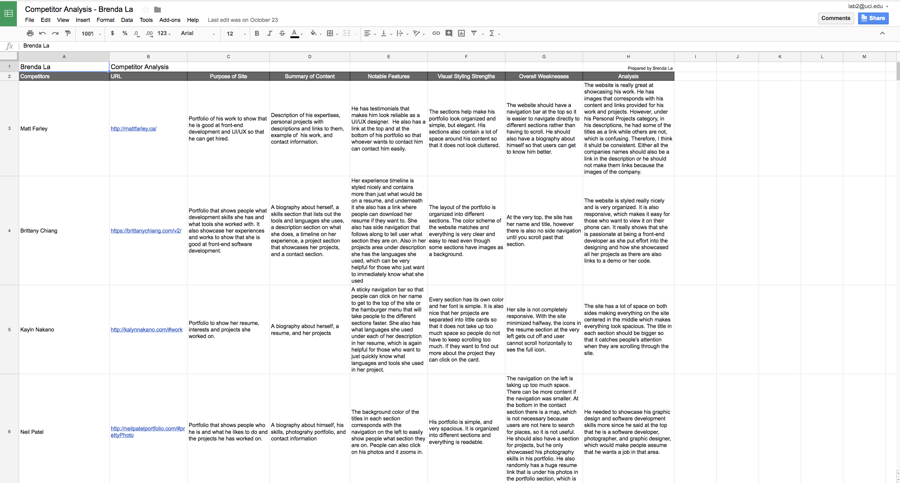
A competitor analysis is a chart that includes the name of the competitor, link to the competitor's portfolio, purpose of the site, summary of site's content, notable features of the site, visual styling strengths of the site, weaknesses of the site, and an analysis of the site. To look for competitors, I went online and found some portfolios by software developers and UI/UX designers. I chose to review these certain competitors because I thought their portfolio was great and also the career they are in is the career I would also want. Therefore, I want to make my portfolio better than theirs. After I found a couple of portfolios, I analyzed each portfolio and wrote down some good and bad features their portfolios contained. This helped me figure what would be helpful or not helpful in my portfolio.
Feature Value Matrix
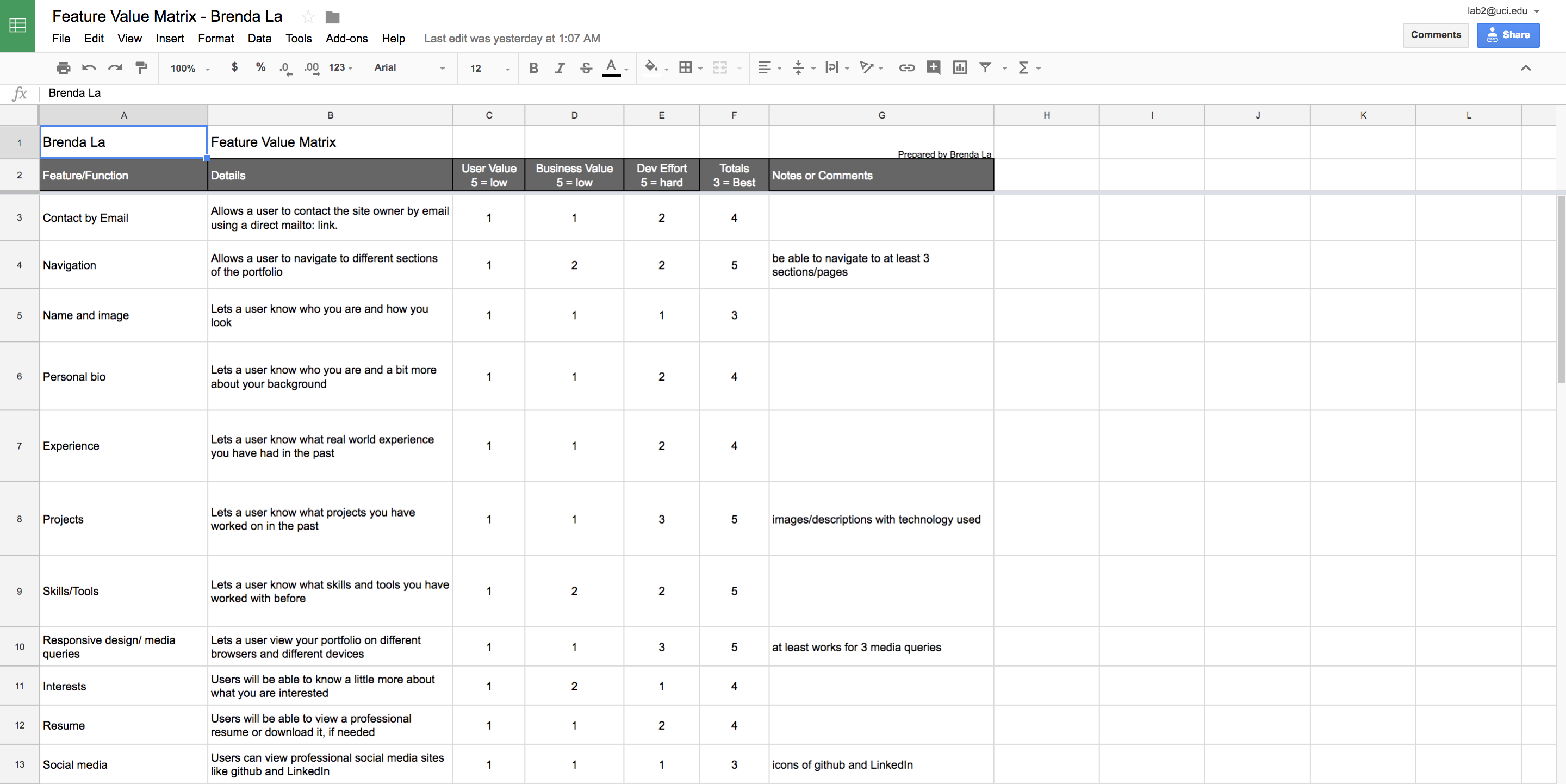
A feature value matrix is a chart that includes features that would be included in a portfolio and a description about each feature. For each feature there is a value, five being the lowest and one being the highest, that would then be assigned based on the user value of the feature, business value of the feature, and development effort of the feature a value. After I found out what users want and I viewed other portfolios, I wrote down features I would include in my portfolio. Features I included are contact by email, navigation, name and image, personal biography, experience, projects, skills, responsive design, interests, resume, and social media. I added a contact section so that they are able to contact me. Navigation helps users navigate around my portfolio. I added my name, image, and personal biography so that users know who the author of the portfolio is, how I look like, and it helps user know a little more about me. The experience, projects, and skills section are used to showcase my skills and work. Responsive design is an important feature because I need to make my site responsive so that it can be viewed on different devices. The resume section is helpful for those who want to look over my resume and download it if they want to. Lastly I selected social media because users can also connect with me on social media.
Feature Prioritization
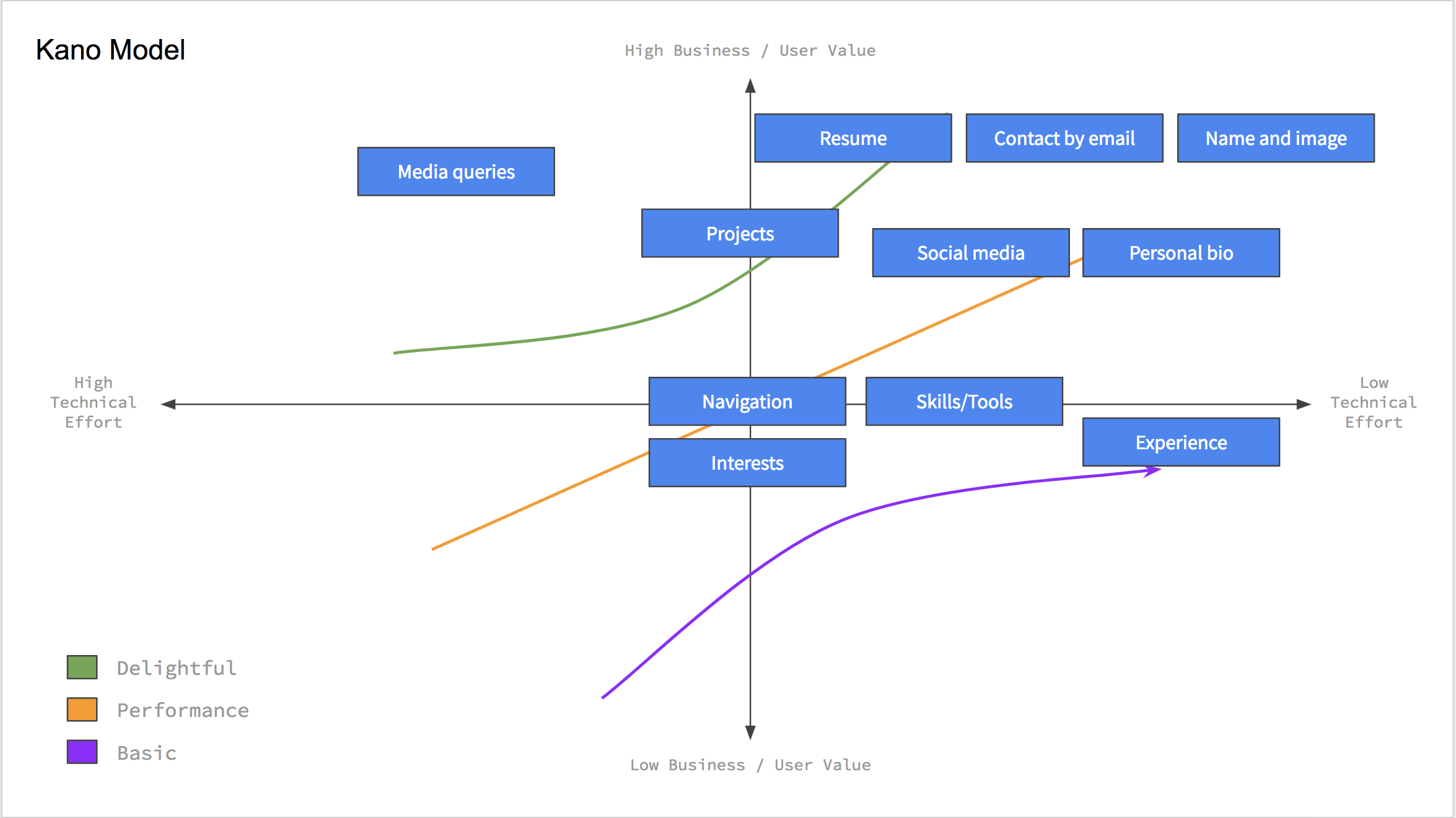
There are two forms of feature prioritization. The first form of feature prioritization is a line that that shows the features that are low priority to high priority. The second form of feature prioritization is known as the Kano Model which shows where the feature lies based on technical efforts, user values, and business values. I was able to figure out where the features lie based on the total values calcuated from the feature value matrix. This helped me visualize which features are more important than others. So when I was builidng the interface, I started with the feature that was the most important and then continued with the next important feature and so on.
User Testing
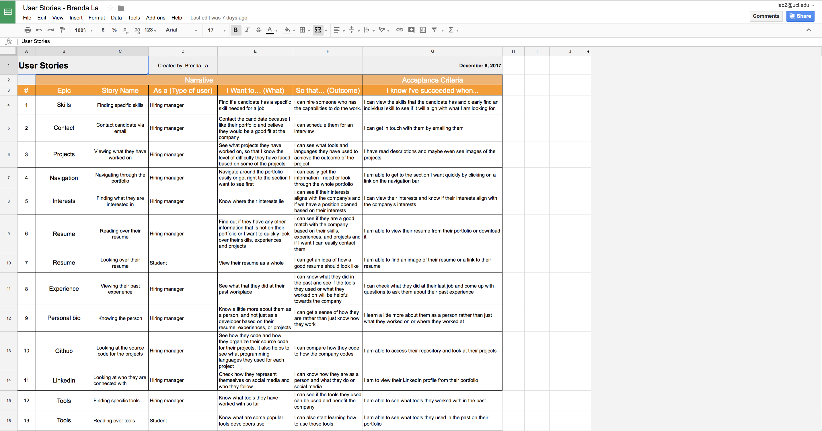
User Stories
User stories contain stories on how different users would use the features. It helped me understand what users want and need to accomplish by engaging with the interface. It also helped me understand why users needed specific content and features. For every user story, I came up with the story by putting myself in the user's shoes. I thought about the user and what they would be looking for and how they would interact with the interface.
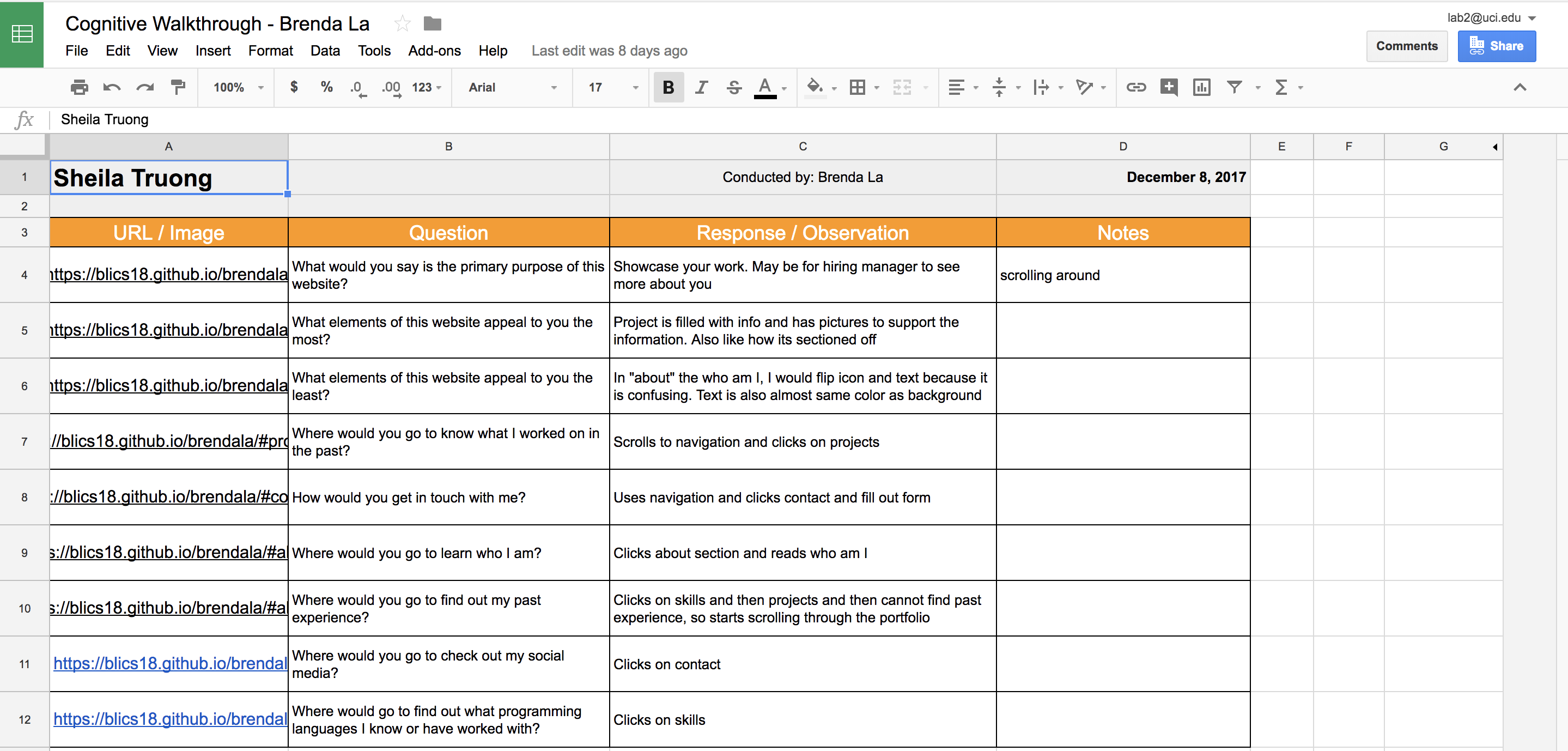
Cognitive Walkthrough
A cognitive walkthrough is a way to test the features implemented with experts. It is an in-person walkthrough of the portfolio. I sat down with the people I interviewed and asked them some questions and asked them to perform certain tasks on the portfolio I implemented. I took notes and wrote down their responses. It helped me see how they responded to the interface and what their thoughts were for each task.
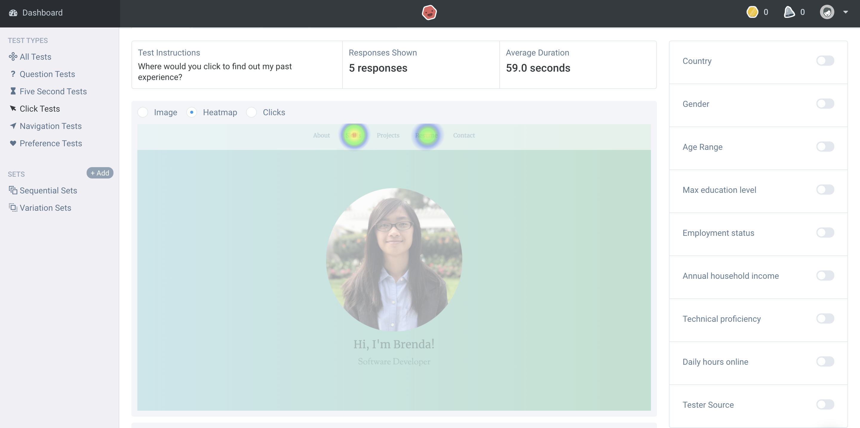
User Test
User tests were done on UsabilityHub.com. I formulated which tasks I wanted to test ahead of time and sent the link to the tests to several users. I made a question test and a click test. I ran a question test because I wanted to ask questions based on the whole portfolio itself, for example the aesthetics, which click test does not cover. I ran a click test because it helped understand how users interact it with portfolio, given a task. Some of the click tests I ran were social media click test, resume click test, and experience click test.
Summary of Findings
When I first started this portfolio, I did not fully understand the use of research. Similarly to many, I thought I would just start coding the portfolio. However, through conducting the user research, I learned that it was to help understand who my users would be. User interviews help shaped the content of my portfolio and the competitor analysis, feature value matrix, and feature prioritization helped me figure out what features to include in my portfolio and which features were more important. After figuring out the features and content of my portfolio, a challenge I faced was deciding the layout of the portfolio, which was why I started with sketches. After deciding the layout, another challenge I faced was the font style, text color, and background color. I did not want my portfolio to be boring, however I also wanted to keep it professional but I also wanted to add a little bit of my personality within the portfolio, which was how I ended up with the color theme you are currently viewing. I love the calm colors and the different font styles I chose for headers and subheaders.
After implementing the portfolio, I conducted user testing, which helped me get feedback on my portfolio. Finding out what users liked and did not like about my portfolio and how users interacted with my portfolio gave me a sense of what I needed to change. I conducted a question test and several click tests. From the question test, I found out what part of the appearance of my portfolio to change. From the click tests, I found out how users interacted with the portfolio, which helped me figure out what to change in my portfolio so that users would have a better interaction with it. Therefore, even though I understood what my users wanted from conducting user research, the results from user testing helped me figure out what to improve.
Incorporation of Findings
After I learned what I need to change, I had to think of how I was going to incorporate them so that I can improve my interface. One of the changes I need to make is the layout of the about and projects section. From the user testing, I had feedback that said that my projects section was confusing because they thought the description corresponded with the photos above or underneath it. However the images and the descriptions are side by side and are alternating because I wanted a little bit of change. Therefore, instead of changing the whole layout of the projects section, I added a line between each project to separate them to avoid confusion. Another feedback is that the experience section is difficult to find because it is under the about section, therefore I plan to make experience its own section and add it to the navigation bar. The layout of the about section was also confusing, since I alternated the descriptions and images, so I plan to either put the images before the description or after the description.
Another feedback I got was the color of the subheadings are a bit light. I plan to make it a darker green but still lighter than the section headings so that it matches with the theme. I also plan to incoporate a tools category in the skills section because all testers said it would be helpful. From the cognitive walkthrough, I noticed that users would have to scroll back up to click on the navigation bar, therefore I plan to incorporate a sticky navigation bar so that it would make it faster for users to navigate around. In the future, when I incoporate all these changes, I plan to also add in smooth scrolling and some animations to make the user experience better.